← ReBranding ... Again!

Jan 02 2017

share

Are Textures in Web Design Still Relevant?

by Guest Writer:

We love simplicity in websites. The acronym K.I.S.S always sat well with me. Keep It Simple Stupid. It’s funny too… see you laughed. I heard it.

When you come across a minimalistic site, you’ll see there’s a heavy emphasis on clean graphically inspired layouts. There’s no “creative graphical fluff,” is that a thing? Sure. But, there are times, especially back in the early days of web design where you find many testing out the limits of textures on websites. Or maybe that was just me… that might be it.

Anywho, you can let me know from your personal perspective if you feel textures in web still have their place. Does it work being subtle, do you mind the hot and heavy, or right in the middle? Here’s a few fun websites we found that can help you decide for yourself.

Let us know in the comments below.

1. Big Daddy Weave

Big Daddy Weave - Website

2. LeaderBe Consulting

Leader Be Consulting - Website

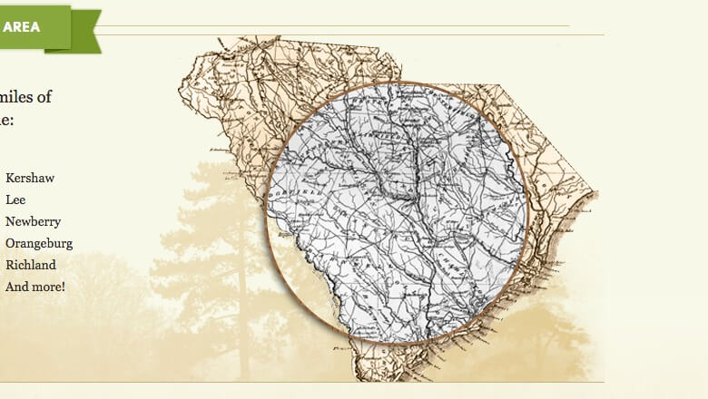
3. Mid-Carolina Timber Co.

Mid-Carolina Timber Co. - Website

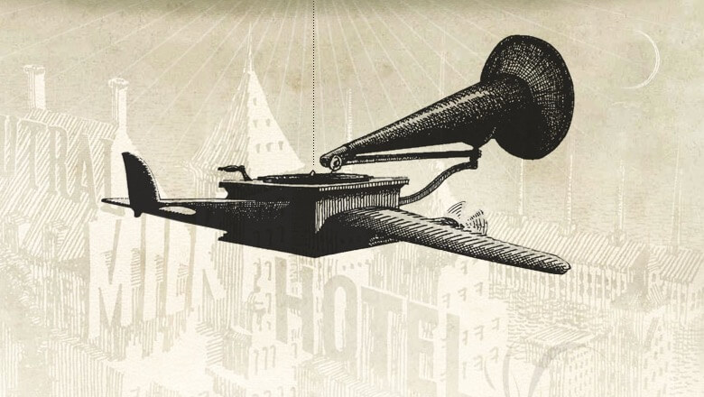
4. Walking Wall of Words

Walking Wall of Words - Website

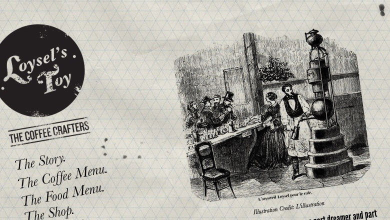
5. Loysel’s Toy

Loysel's Toy - Website

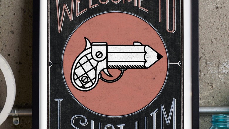
6. I Shot Him

I Shot Him - Website

Topic(s):

  • Design
  • Connect with Variety Studios website →

    Instagram Facebook Twitter

    Variety Studios is based out of Syracuse New York, specializing in web design and brand identity, plus more (just ask). We provide small and mid sized businesses affordable and professional solutions to their design needs.

    View all articles by

    Subscribe
    Notify of
    guest
    9 Comments
    Oldest
    Newest Most Voted
    Inline Feedbacks
    View all comments
    Dennis
    Dennis
    7 years ago

    I would say yes, absolutely. A clean, efficient website can still make use of textures. A website design doesn’t have to be littered in texture graphics/backgrounds for that to qualify however. I mean, you can create a nice logo or header using a texture. Or as a background for a section of the page. Also, I generally use them sparingly in a layer set to 20/30%.

    Marcus Lewis
    Admin
    7 years ago
    Reply to  Dennis

    Hey Dennis, I totally agree with you! I’ll admit, I have definitely overused some textures in the past, thinking it was the “cool thing to do.” But, we live and we learn haha. I am a fan of subtle textures though.

    Thanks for stopping by!

    Seveti
    7 years ago

    I love that only one of the examples in the article actually uses a ‘texture’ as opposed to having backgrounds.

    Marcus Lewis
    Admin
    7 years ago
    Reply to  Seveti

    I’m glad you have an opinion on the topic. *two thumbs up and a smile* :)

    Randy Hadzor
    7 years ago

    A little texture here and there as an accent might be alright.. but I’m all about getting rid of unnecessary file size!

    Brian Sykes
    7 years ago

    Be genuine to the brand. Sure, texture is great – if it is relevant and helps communicate the brand story. If it is “fluff” and has no purpose except to fill dead space… then it is not needed. In college I had a great illustration instructor who taught us that knowing what to leave out was just as important as what you actually put in. I think he was onto something.

    Marcus Lewis
    Admin
    7 years ago
    Reply to  Brian Sykes

    So true! I think there’s a place for it. You’re illustration instructor hit it dead on. There’s something beautiful about negative empty space. No need to always fill every corner.

    Thanks!

    Tom
    Tom
    7 years ago

    So happy I stumbled across your article. Just this week I’ve been considering using textures in a new project. Part of me was worrying about using past trends, most of me was saying: it fits, it suits the brand and feeling I want. It’s encouraging to see some other views out there :-)

    ← ReBranding ... Again!

    9
    0
    Would love your thoughts, please comment.x
    ()
    x